Overview
UX Strategist @TBWA\ Singapore (Asia HQ)
Joining the SIA-Turbo team at TBWA\ as a UX strategist, I spearheaded projects for one of Singapore Airlines’ (SIA) core business units—airline e-commerce (ECD)—translating research and strategy into wireframes to revamp its digital experience.

My Role
Account: Singapore Airlines, Client Facing
Collaborating with other strategists, designers, writers, and account managers in an agile environment, I conducted strategic research and delivered wireframes through weekly sprints—often co-hosted with an external development team. Most client communication took place during WIP meetings. Below is the list of my general responsibilities for each sprint cycle.
- Competitive Analysis, UX Audits (Heuristics)
- Generating wireframes based on research
- Leading WIP Meetings and sprint reviews
Case 1. Customer Booking (CIB)
📋 Problems
1. Declining Conversion for Mobile Web
Singapore Airlines is experiencing a decline in customer retention on its e-commerce site. Conversion rates (CVR) for desktop and mobile web have been steadily dropping, with significant variation across device categories—desktop, mobile, and tablet. Notably, mobile web conversion rates have plummeted sharply. These trends suggest multiple potential interpretations:
- Users are ditching web for apps these days.
- The desktop website is not mobile friendly.
- Users prefer large screens when booking flights.
- Users only check fares and dates on mobile.
2. Hassle-Causing Multi-Pax Booking
The linear process of mobile web booking creates repetitive tasks, which becomes even more cumbersome when booking flights for multi-pax. Users face significant hassle when required to configure details like dates, fare classes, passenger information, and meal options in a strict linear process, without the flexibility to navigate back and forth freely.
📋 Usability KPIs
To measure success, we identified conversion rate (CVR) and revenue per visitor (RPV) as key performance indicators, as both are directly linked to customer booking process. Additionally, task completion time was tracked, as our primary goal was to streamline the booking experience.
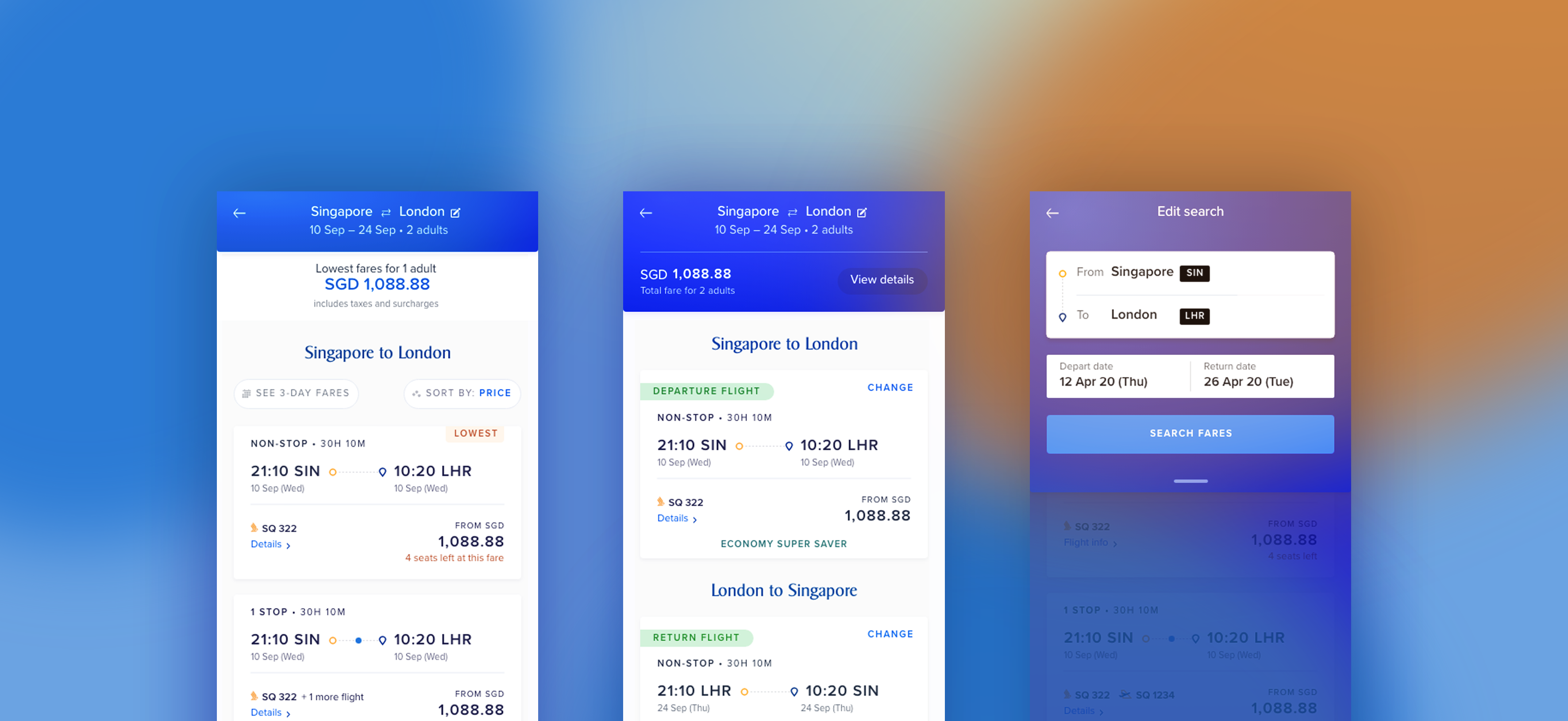
📋 Wireframes
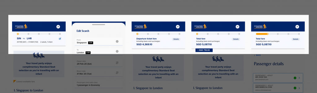
Chances are, users often lose their way while completing the booking task. To address this, we proposed a solution that enables users to navigate back and forth between pages using modal views. These modals break the process into individual sections for each pax details, independent of task completion. Previously, users had to complete one pax details at a time.
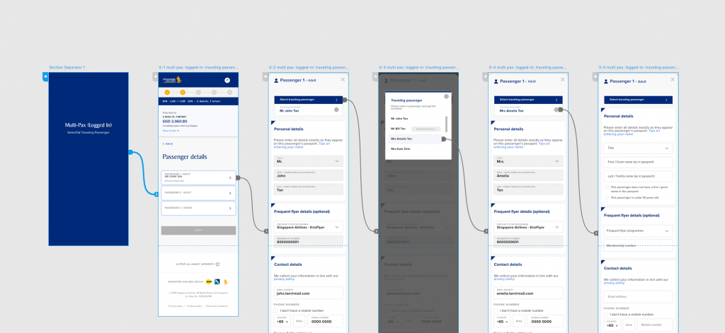
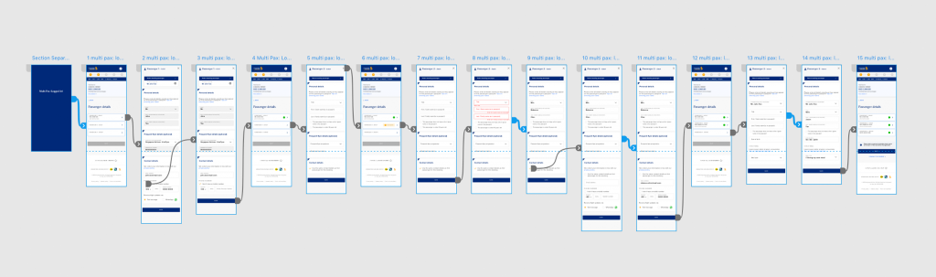
You can either click here to view an early demonstration of the wireframes or interact with them by clicking each in the list below. The accordion-style tabs for passenger details provide a flexible, non-linear process. Users can navigate between views (tabs and pages) as needed, allowing them to open, edit, and collapse a tab without completing it, and return to it later.
- Scenario 1. Selecting Traveling Passenger
- Scenario 2. Multi-PAX (Logged In)
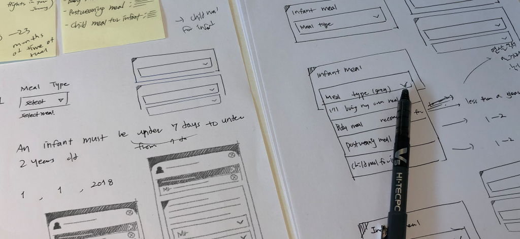
- Scenario 3. Infant Meal Selection
- Scenario 4. Confirming Passenger Details
- Scenario 5. Multi-PAX (Non-Logged In)
- Scenario 6. Single-PAX (Logged In)
- Scenario 7. Single-PAX (Non-Logged In)
📋 Evaluation (Post-Delivery)
We planned and conducted an A/B test and usability tests to evaluate our new design. Below is a brief overview and the results.
1. A/B Test Result
- Scenario: Multi-Pax Booking (+ Child/Infant)
- Platform: Mobile Web
- Duration: 2 Weeks
- Conversion Rates: Old Design – 2.32%, New Design – 2.92%
2. Usability Test Results
- Scenario: Multi-Pax Booking (+ Child/Infant)
- Platform: Mobile Web
- Participants: 6 Individuals
- Task Completion Time (Avg.): Decreased by 41.5% compared to the old design.
📋 Hand-Off
Here is an example of a presentation I delivered. It outlined our new design, which is now live on the Singapore Airlines website.
Case 2. Currency Selector
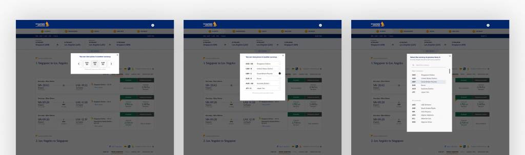
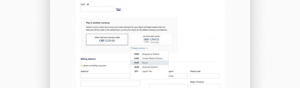
📋 Problem
Based on an exploratory log analysis, we discovered that most users are not utilizing the Currency Selector effectively. We conducted interviews to understand why people don’t utilize or benefit from the Currency Selector.
Key Issues (Interviews)
- Users simply don’t recognize the feature. (★★★★)
- Users perceive it can only be configured during the Flight Search stage. (★★★★★)
- Users think SIA supports only major currencies for actual transactions. (★★★)
- However, users can still view other currencies — leading to confusion. (★★)
📋 Wireframes
We delivered multiple presentations and wireframes showcasing a range of design options. The goal was not only to allow users to view and change currency throughout the entire flow, but also to benefit the company financially in the long run.
You can either click here to view an early demonstration of the wireframes or interact with them by clicking each in the list below.
Case 3. BSP Feature
📋 Problem
Booking can be tedious due to excessive text fields, call-outs, and checkboxes. Our next objective was to eliminate unnecessary steps across the flow. We began with BSP, a summary element with a progress bar, which had redundant information.
Key Issues (UX Audit)
- The BSP takes up unnecessarily large space — particularly on mobile web — blocking the screen. (★★★★★)
- The BSP provides unnecessary information, deviating from its original purpose. (★★★★)
📋 Wireframes
Identifying and removing all redundant and repetitive content in the BSP, we significantly reduced the feature’s size. While a few policy-based call-outs (required by aviation law) remain, addressing these elements will require more intricate coordination later on.
You can view the wireframes and interact with them by clicking each in the list below.
Other Cases (Manage Booking, Responsive Web, etc.)
In addition to the above cases, my responsibilities also include analysis-only projects without delivering wireframes. Please note that much of my work involves sensitive information and is currently protected under NDA.