- March 31, 2017
Overview
TBWA\ Singapore (Asia HQ)
Account – Singapore Airlines (SIA)
Joining SIA-Turbo team at TBWA\ in 2019, I spearheaded UX strategy for one of SIA’s core business units: airline e-commerce (ECD) as a UX consultant, translating user research & strategy to wireframes to revamp its web & mobile web features.

TBWA\ — The Disruption® Company
Client Facing Role – Research & Strategy
Working alongside with other strategists, UX writers, designers, and account/project managers in an agile environment, I delivered strategic research (findings) and wireframes through weekly sprints — often co-hosted with an external engineering team from TCS. Most of the communication with the client then took place during WIP meetings at Changi. Below is the list of my general responsibilities for each sprint cycle.
— Competitive Analysis & Usability Audits (Heuristics)
— Wireframing (Designing for Conversions)
— Evaluative UX Research via Guerrilla Testing, Workshops, A/B Tests, etc.
— Funnel Analysis (Tracking CX metrics/KPI with GA)
— Leading Sprint Reviews & WIP Meetings (Client Facing)
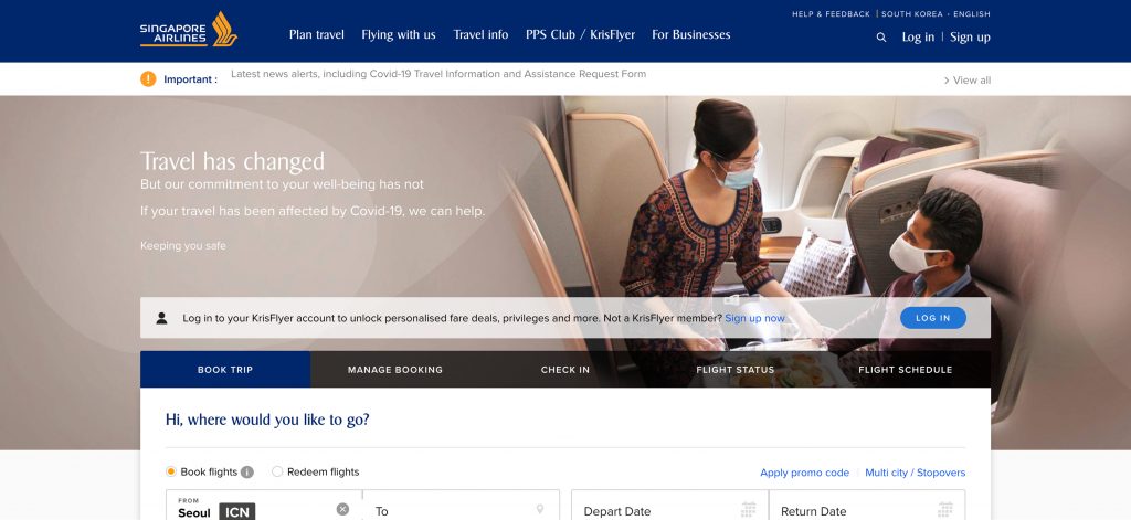
Singapore Airlines — Book International Flight Tickets
Case 1. Customer Booking (CIB)
01. PROBLEM – SIA is losing customers on its e-commerce site. — CVR for desktop & mobile web has steadily been dropping over the past several months. Also, CVR per device category heavily varied between desktop, mobile, and tablet. Mobile web, in particular, recently plummeted while desktop web is performing relatively better. This implies various interpretations:
— Users are simply ditching web for apps these days.
— The website isn’t mobile friendly.
— Users prefer using a large screen device when booking flights.
— Users only check fares and dates on mobile.

Tablet vs. Mobile: Which Converts Better?
select
    device_type,
    count(distinct w.website_session_id) sessions,
    count(distinct o.order_id) booking,
    (count(distinct o.order_id)/count(distinct w.website_session_id))*100 cvr
from website_sessions w
left outer join orders o on w.website_session_id = o.website_session_id
where w.created_at < '2019-11-01'
group by 1
SQL Query Example (CVR per Device)
02. AUDIT & REVIEW – Mobile web booking, with its linear flow, leaves users with many repetitive tasks. This gets even worse when you are booking flights for multi-pax. It’s such a hassle when you have numerous UI elements to configure such details as dates, fare classes, pax details, and meal options in a linear manner when you’re not allowed to navigate back and forth freely.
03. KPIs – Starting from Pax Details, our goal was to streamline the process. I set CVR and RPV as major indicators since they both relate to customer booking. Task completion time has also been measured as it heavily affects multi-pax scenario.
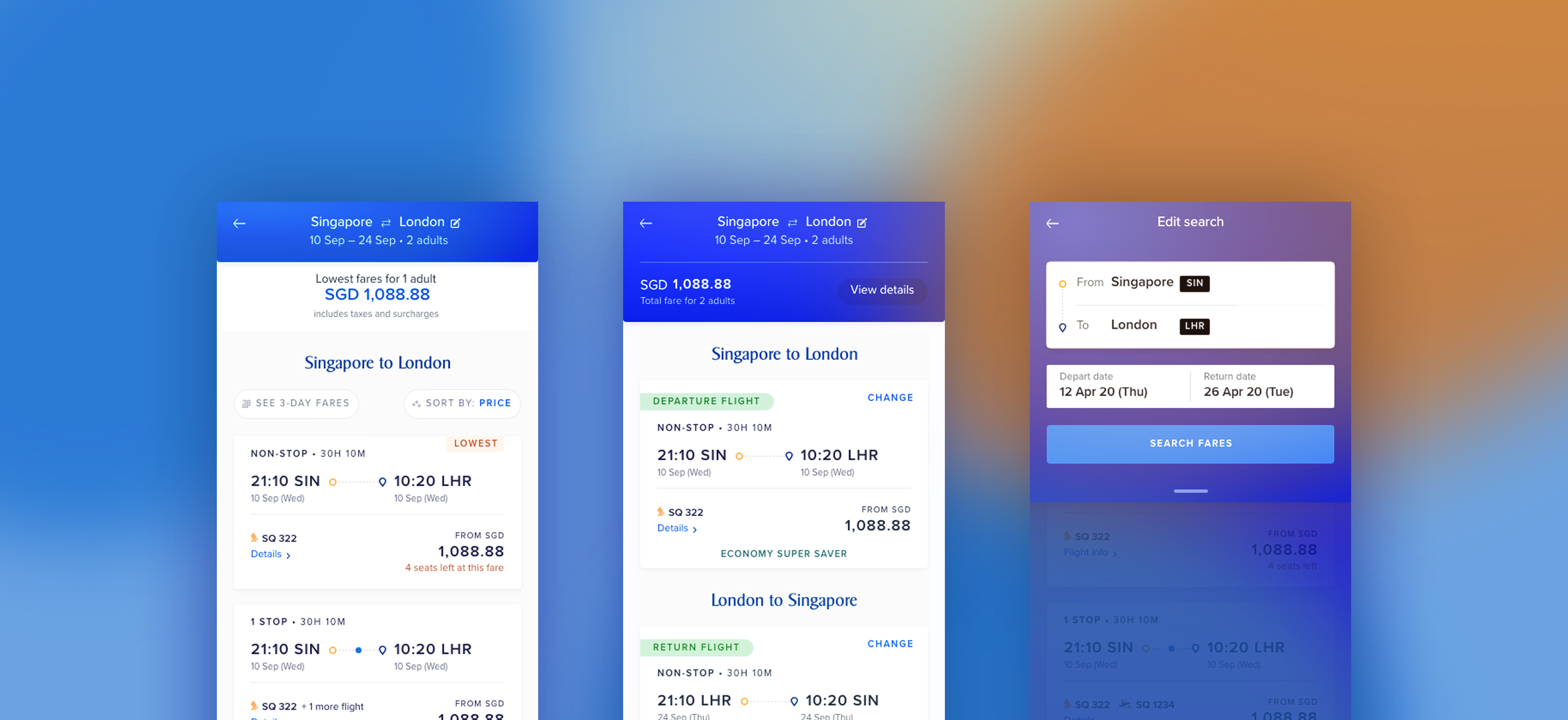
04. WIREFRAMES – Chances are, users often lose their way while completing the task. The solution I came up with, was to allow them to navigate back and forth between pages, using modal views — slicing them down to each pax detail regardless of task completion — previously, you had to finish one pax by one pax in a linear manner.
Low-Fidelity Wireframes — Internal Communication
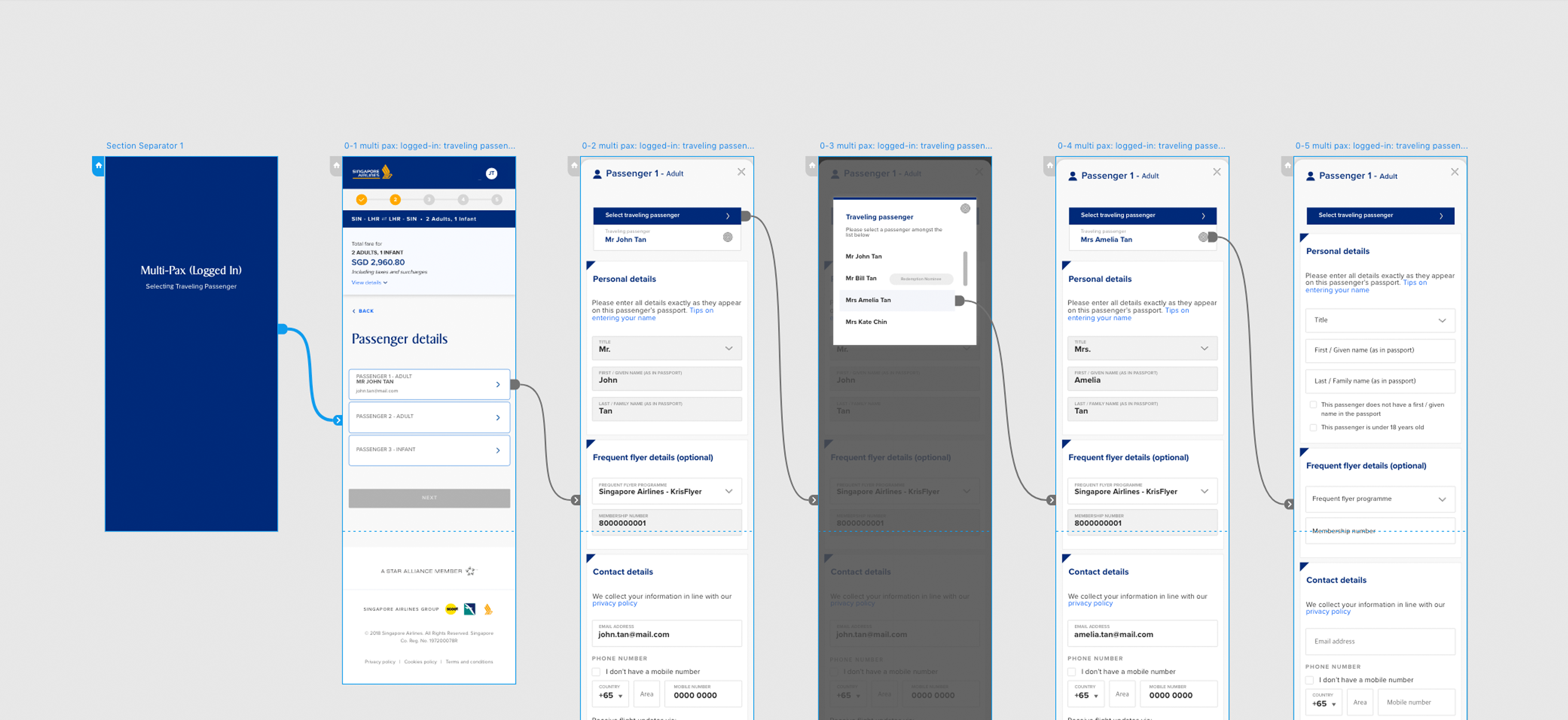
High-Fidelity Wireframes — WIP Meetings / Client Facing
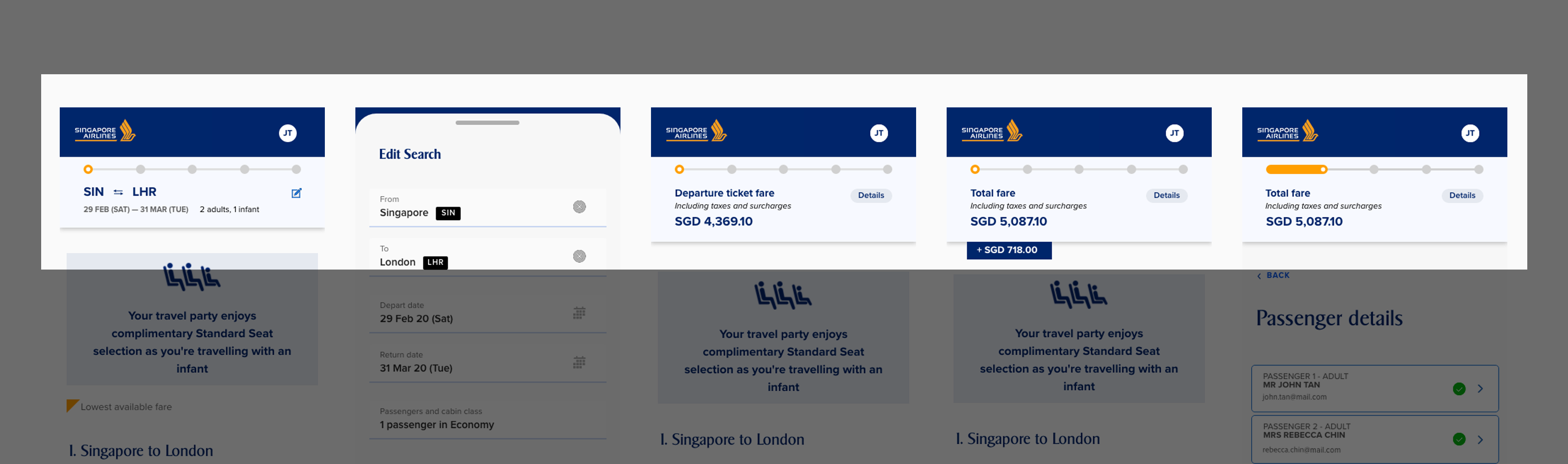
— You can either click here for an early demonstration of the wireframes or try them yourself by clicking through the image below. For your information, this is just one of the scenarios. They widely vary depending on who you are traveling with, what your nationality is, etc.
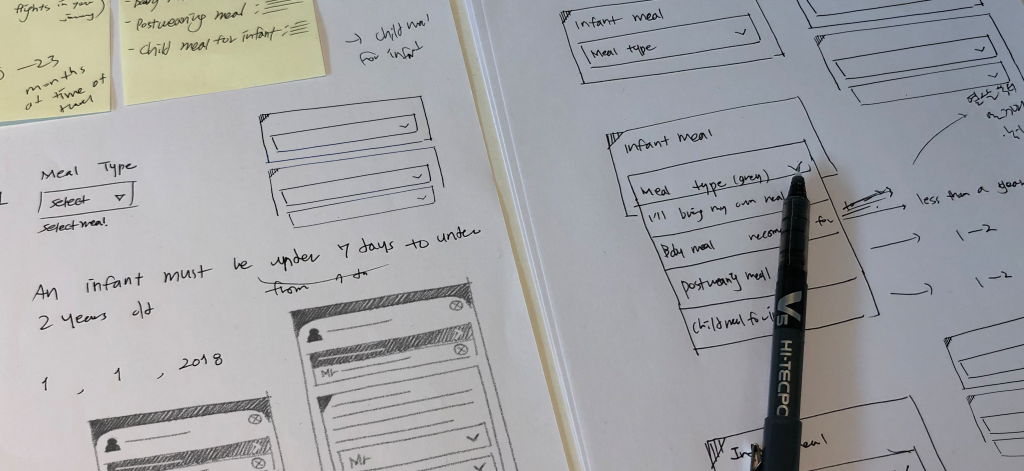
— Other scenarios are available if you’d like to have a look: 1. Selecting Traveling Passenger, 2. Multi-PAX (Logged In), 3. Infant Meal Selection, 4. Confirming Passenger Details, 5. Multi-PAX (Non-Logged In), 6. Single-PAX (Logged In), 7. Single-PAX (Non-Logged In)
As can be seen, the accordion-type tabs for pax details offer a flexible & non-linear process as you can always navigate between views (tabs/pages) whenever needed; users can open, edit, and collapse (leave) a tab unfinished and come back later.
05. EVALUATIVE RESEARCH – Walking through the wireframes (hi-fi) with the client during WIP, we decided to then test them for evaluative purposes. I conducted an A/B test and a lab test (semi-controlled) with several participants in the presence of the client team on site.
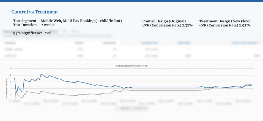
A/B Test (2w) Result — Conversion became approx. 25.9% higher than the control design
For the lab test, I measured task completion time, splitting participants into two groups to ask them to use each control/treatment design. After the session, follow-up/exit interviews were conducted for 10-20 mins in duration.

This whole session was recorded and transcribed with their prior consent. — Test segment: Mobile Web, Multi-Pax Booking (child/infant), Sample: 12 Participants (Gender: Mixed, Age Group: 30-40)

Lab Test Result — Task completion time decreased by 41.5%
P-value: 0.0425 (unpaired t-test)
06. HAND OFF – Here’s one of the example presentations I delivered at an initial phase of the project. — It was conveyed remotely with slides due to COVID-19 pandemic. The treatment version with new design is now on SIA’s live site.
If you’ll excuse my weird voice. 😂
Case 2. Currency Selector
01. BACKGROUND – I defined areas for improvement mostly by leveraging data, trying to integrate it into design. As a consultant, I was granted access to SIA’s e-commerce data via Google Analytics & SQL server database. I used these platforms to assess, evaluate customer experience, often define problems to investigate further with some in-the-wild interviews, usability tests, etc.
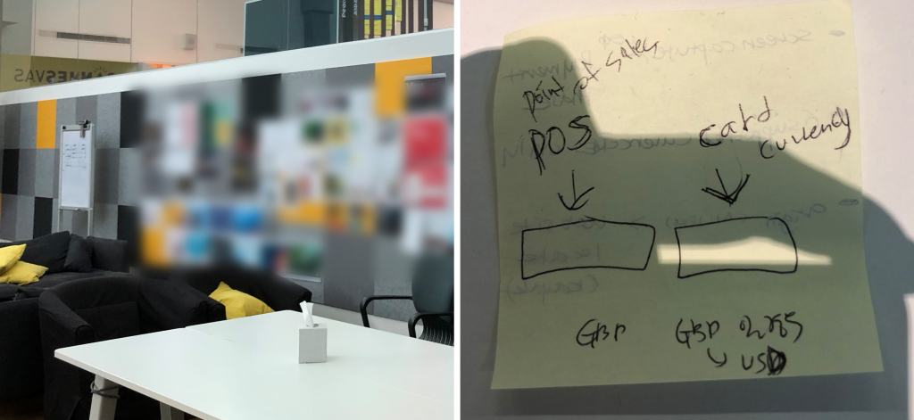
SIA’s international business requires a new strategy for diverse currencies.
*Currency Selector allows users to view/pay fares in the currency of their choice — based on the payment card’s country of issue at the point of sale (POS).
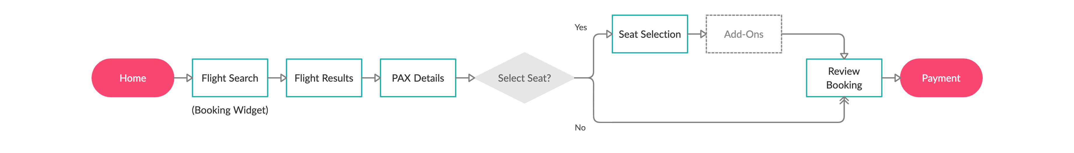
02. CIB BOOKING FLOW – Below is the simplified flow chart that shows how customers book flights.
03. USER BEHAVIOR – According to my foundational research, users don’t visit the website only to book flights, but also to simply view fares and flight schedules. They later then come back to book flights, add-ons, or upgrade seats.
04. PROBLEM – Given that many users drop off after spending some time on Flight Results page, viewing fares/schedules is clearly an important behavior to look into. However, most of them don’t benefit from the Currency Selector feature.
05. GUERRILLA TESTING – The problem was defined based on SIA’s logs data and it left us some unanswered questions about ‘why’. I conducted guerrilla testing, trying to answer these questions.
— Observation: I asked the participants to go through the booking flow until they reach Payment.
— Exit Interview: I asked questions about their behavior to interpret motives based on observation.
Findings
— Some users simply don’t recognize the feature.
— They think the feature is obsolete because it can be configured only at Flight Search.
— The feature is useless because SIA currently offers only major currencies for actual transactions: USD, EUR, GBP, etc. — though the users still get to see other currencies, causing confusion.
06. COMPETITIVE ANALYSIS – Initially, I conducted competitive analysis to see how other airlines are handling this, also reviewing indirect competitors such as Expedia and Trivago.
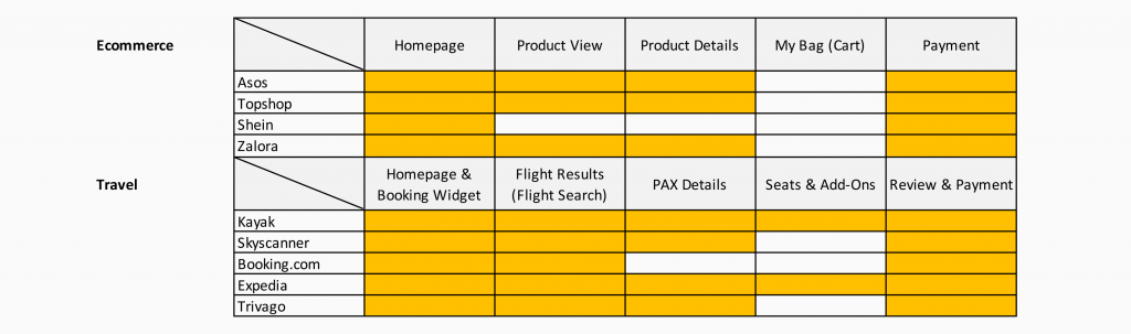
Indirect Competitors & Other Platforms
07. WIREFRAMES
At the end of the project, I delivered multiple presentations with a range of hi-fi wireframes. The idea isn’t only to allow users to have the freedom of viewing and changing currency throughout the entire flow, but also to benefit SIA financially in the long run.

Currency Selector @Flight Result — Light Box Variation

Currency Selector @Payment — Dropdown
— You can either click here for a quick demonstration or simply click through the image below to try the wireframes yourself.
— Wireframes are available: 1. Initial Approach, 2. New Approach, 3. Light Box Variation
Case 3. BSP Feature
01. BACKGROUND – Previous cases show booking (CIB) can be very tedious since there are lots of text fields, call-outs, check boxes, radio buttons, toggle buttons, etc. Thus, we set our next goal to eliminate all the unnecessary steps over the entire flow.

We hosted bi-monthly stakeholder workshops to work out what’s next.
Starting off, BSP, containing a large amount of redundant information, was selected to be the first for the review. It’s a summary type element on the top of your screen, containing such elements as a progress bar, a summary of pax details, flight schedules, dates, fares, etc. The type of elements varies depending on scenarios and pages.
02. USABILITY AUDIT – Mobile web, in particular, with a small screen size, has a lot of constraints in design. Imagine you have a huge call-out that takes up nearly half of the screen. Unless you are on a desktop, this can create an adverse effect on overall usability. — So, what’s the BSP feature for?
— It shows the current progress so users recognize where they are in the flow.
— It provides a summary of booking at hand to prevent human errors.
03. WIREFRAMES – Removing all the redundant, repetitive contents in BSP, I cut down the size of the feature, and was able to stretch the rest. A few policy-based (aviation law) call-outs are still there, but these elements require some intricate coordination in Day-2.
— Wireframes are available here if you’d like to have a look: 1. Multi-PAX (Logged In), 2. Archive
Case 4. Manage Booking
01. BACKGROUND – Part of my responsibilities in user research was delivering reports for internal share and communication. This was often bundled together with competitive analysis.
02. HEURISTIC EVALUATION – To avoid bias & subjective analysis, I used Jakop Nielson’s heuristics as a starting format. In doing so, the team and I were able to use a reliable, commonly accepted method for evaluative research. I also applied this technique to competitive analysis, evaluating major competitors’ websites: Emirates, Qantas, and Cathay Pacific. Then I reviewed SIA to assess its Manage Booking flow, reflecting what I learned from them.
*Manage Booking helps users manage details about their booking, such as updating pax details, upgrading seats, changing add-ons, meal selection, etc.
HEtemplate_SIA
Case 5. Responsive Web: Day-1
One of the strategy projects I spearheaded was formulating a long term plan for responsive web (per device category). Just as other software projects, I slice it down to Day-1 and Day-2, so we can launch and learn quickly. Given that users exhibit unique patterns of behavior per platform and device, it’s important to take a multi-dimensional approach.
First of all, I nominated five competitors (airlines). They all have different strategies for the web, but provide both inbound & outbound flights to/from S’pore like SIA.
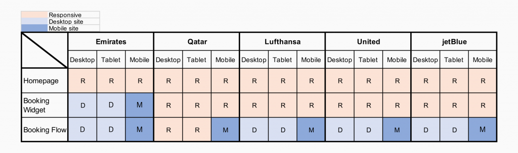
5 Airlines with distinct web strategies
As can be seen, Qatar has an almost full-responsive website while Emirates operates with some non-responsive features. This is an important indicator that shows how they are handling the web in business. One interpretation can be: Emirates to put more weight on mobile as they have it separated in control.
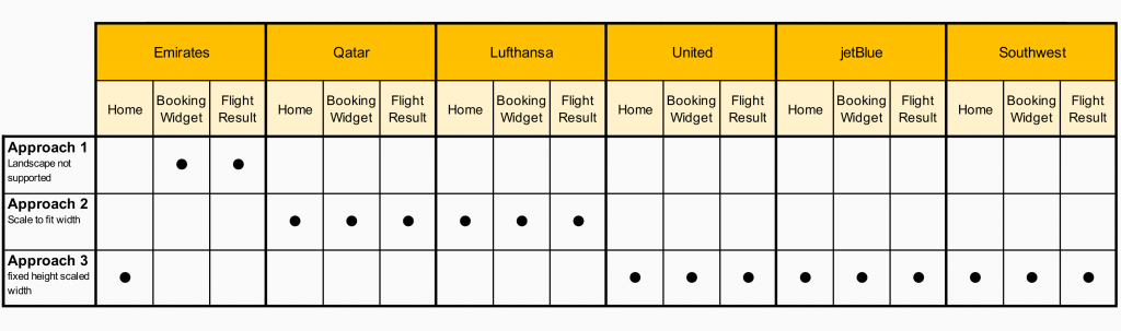
Emirates doesn’t display in landscape mode at all (except for the homepage).
At the end of the project, I was able to convey a two-year strategy and long term deliverables with a roadmap for SIA. — Please note that most of my work is currently NDA protected.